The Lyme Art Association: An EL Treasure
April 25, 2023
A rainy Saturday afternoon, pebbles crushing as you walk over them to an antique looking almost 1950s gallery collection, excited as to see what you’ll find. This was me going to the Lyme Art Association on March 25th and despite my quick 20 minute gallery walk when they were just about closing, I found some great art. Ok, a lot better than “great”. So, stick with me to what I found.
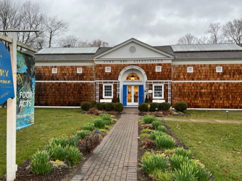
The Lyme Art Association, an art gallery connected to Florence Griswold was comforting, quiet and brightly lit just as I walked in. The receptionist gave me and my family brochures for the gallery and immediately I was astonished by the quality of artwork produced and hung here.
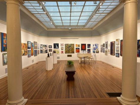
The four different acts of this gallery included Abstracted art, Still life art, Long and lean art and Off the press art.
The abstract and still life art were the first acts we saw entering the gallery and they definitely set the mood of the gallery as a free-flowing imaginative space.
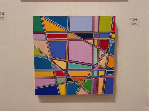
One abstract art piece “Dreamscape/ Cityscape #1” by Grey Jacobik represented many such colors clashing with each other yet ebbing and flowing as if they were made for each other. The name for the painting was perfect as the strict lines surely looked like a city landscape.
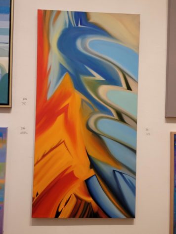
Bright red and blue paint enveloping and comforting each other was the subject of another notable abstract painting called “Fire and Ice” and made by Tom Swimm.
But my favorite out of the three was Helen Cantrell’s “Three Friends, Terrace Sunset”. Using oil paints on a canvas, Cantrell’s picture depicted three figures blended into the background and made it like a guessing game to pick each one of the friends out clearly. The texture this painting had with the water dripping onto the boys really made me like it along with its use of different colors in nature.
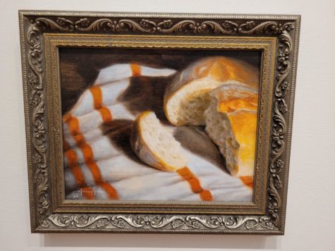
Moving on to the next act which was Still art, many of the pieces were ranked by number in terms of art competitions won by artists in the gallery. The third place winner here was said to be Mike Laiuppa’s “Boule on Tea Towel” depicting a realistic piece of bread lying on, you guessed it, a tea towel. But don’t be fooled by the seemingly simple painting because according to one of the critics at the Association, “it is expertly painted- [though] it’s not easy to make bread beautiful” The highlight for me wasn’t as much the subject of bread, than the use of textures to make the bread feel mouthwateringly real and also the use of the towel to make it seem more antique and old-fashioned.
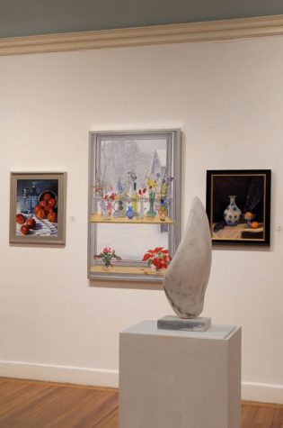
But some of my personal favorite Still art pieces were those that didn’t hold a place in some of the art competitions. One that I actually came across after going to the gallery, called “Still Life with Window” by Martin Trehub, illustrated an elegant portrayal of snow and different types of flowers by a windowsill that immediately made me feel at peace and like a kid again, playing out in the snow with no worries and having fun. The other painting hung just next to it was a pile of apples I had originally mistaken for tomatoes called “Apples” by Pamela J Danneman. The reflection of the light on this one really stood out to me the most and caught my attention the minute I looked in its way.
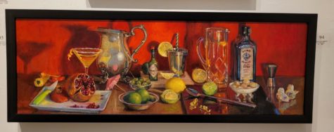
In the next room sat the Long and Lean acts where I started seeing a lot more paintings of my style and that I really loved. Some of my favorites from this section were those that had an attention-capturing background. One of these, Virginia Morrisey Bilodeau’s “Let’s call it a day” made with oil paints showed basically a kitchen with pomegranate, lemon and different wines. Overall, the vividness and realism of these items pulled me into this drawing but nothing more so than the painting’s bright red background.
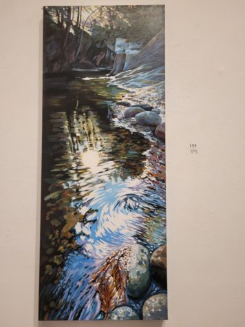
Another long and lean painting I loved was “Warren Falls” by Dina Belyayeva. A more abstract type of painting, “Warren Falls” depicts a lake in a relatively simple manner, until you focus on the sunlight’s reflection off of the lake. For me, this generated a feeling and a sense of being at one with nature, even though it may not be the most realistic painting.
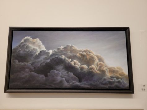
My last favorite Long and Lean piece was Mike Laiuppa’s “Jacob’s ladder”. Recognize the name? Yeah that guy is a genius. Anyways, I really loved this painting portraying a dark cloud enveloping the sky because of the light and dark contrast between the upper portion of the cloud and the lower. The shading is done so beautifully that it honestly feels like the painting is enveloping you. And overall, the light behind the clouds also added to the feeling of doom and peace that the painting evoked.
Almost done! The last real “act” of this gallery was the Off the Press art, which focused on printmaking and highlighting a variety of techniques and media through print. I had no idea this type of art was so popular until I came to this gallery and it really opened my eyes to something new. So, one of my top 3 favorites of this art was “Winter” by Egan Liz which was a woodcut piece showcasing a forest in the middle of winter. What I really liked about this art was the way that it was made with colors and designs not completely filled in yet in some way exactly that, complete. Another favorite of mine was “Look” by Olivia Bosson. I really loved the old-fashioned colors in this painting along with the textures of the brick buildings and pavement in the background and the girl’s dress in the foreground. My last favorite from this style of art was “Monolith #5” by Micheal Gain. I just love mosaic art and the use of a mosaic type painting and the different shades of red added so much newness to the gallery and educated me about a type of art I had never really seen before.
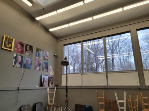
And finally, the Epilogue. As I made my way downstairs to the Miles Brook Gallery so many different paintings, all so unique, stared back at me. So it didn’t come as a surprise to know that the Epilogue of this gallery had paintings from all of these four different “acts” combined. I also saw the art studio they had downstairs that was used to teach art classes to interested teens and adults.
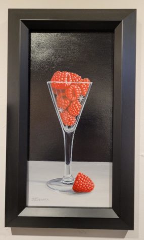
My true favorite out of this section was the “Raspberry Cordial” by J Elaine Senack. This piece was so realistic, new because I had honestly never seen a painting of a raspberry before and eye-catching with a black background to a painting of red raspberries. The only “criticism” of this piece that I had was the asterisks that were between the raspberries because in my opinion, that reflection of light seems fake.
But overall, my experience being at the Lyme Art Association and touring all of these different paintings was amazing and I can’t wait to look at more from either this or their next collection coming out April 27th. If you’ve stayed this long, please visit the Viking Saga webpage and take a look at all the art our town has to offer with Florence Griswold, the Lyme Art Association or other places because trust me, it’s worth it.